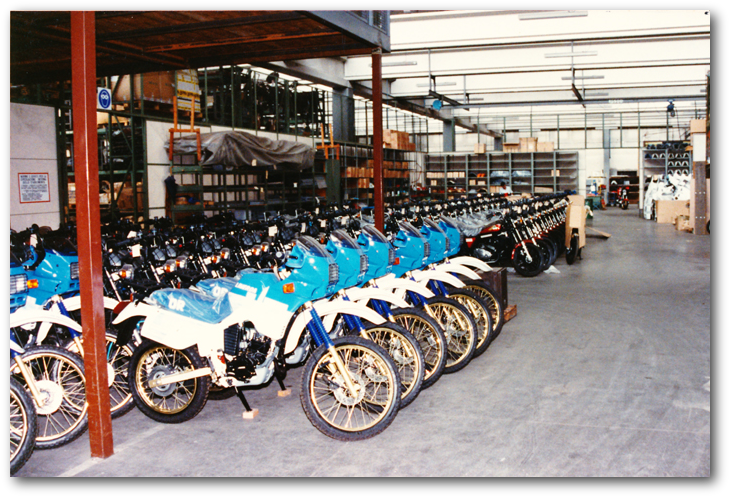


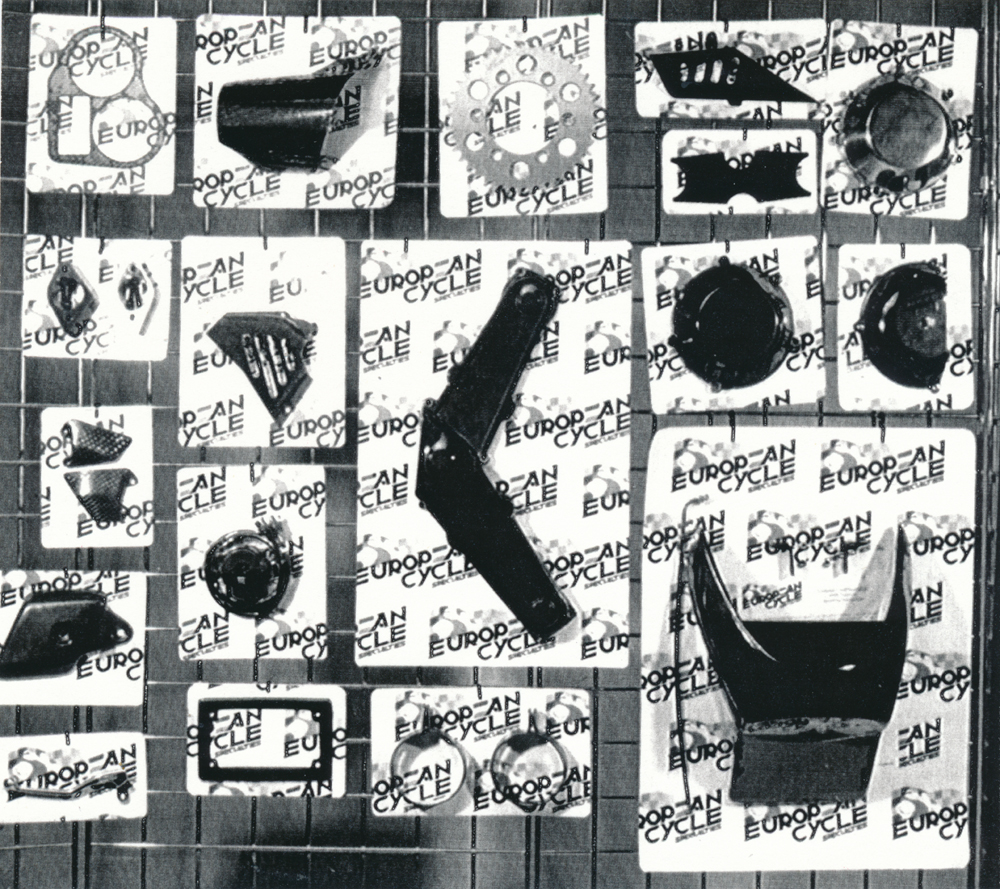
The impact was dramatic. Suddenly Steve's shop was on the national stage. Sales were on a scale he never thought he'd reach. Steve’s shop was twenty five hundred square feet of old linoleum and wood veneer filled with mechanical fantasies. It was more social club than retail motorcycle showroom and the area's finest performance service department. At the beginning of 1986 it was all exchanged for 6000 square feet of new commercial building. A second stage look was called for as an entire new line of performance equipment manufacturers had signed on for distribution. The focus now was packaging graphics for the vacuum sealed plastic peg board displays. This required an enhanced point of purchase identity. At right is the first concept sketch for the new lettering system. This was quickly followed by a new media-kit / catalogue.
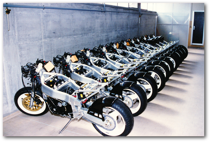
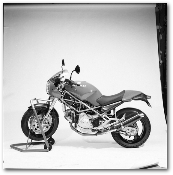
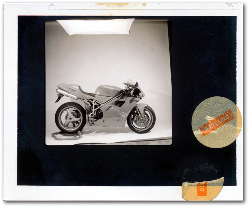
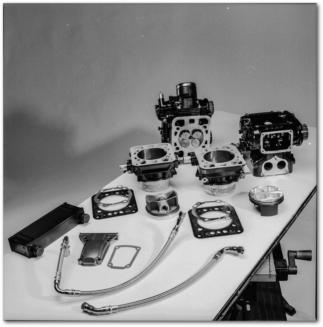
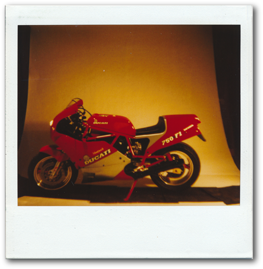
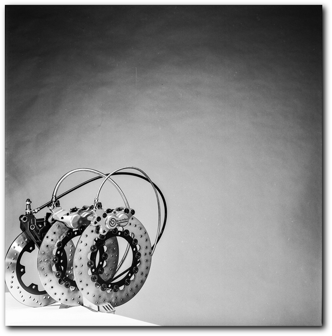
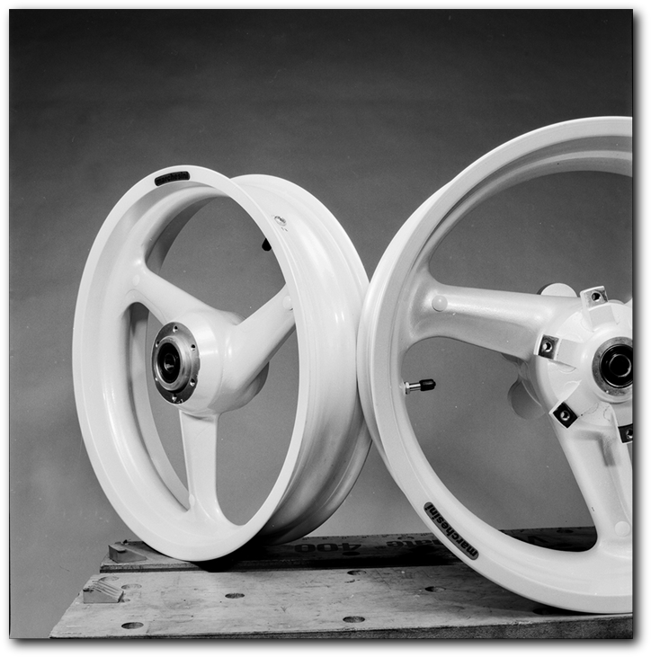
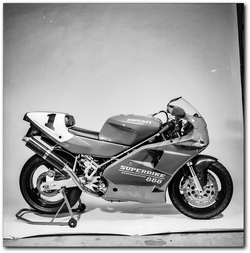
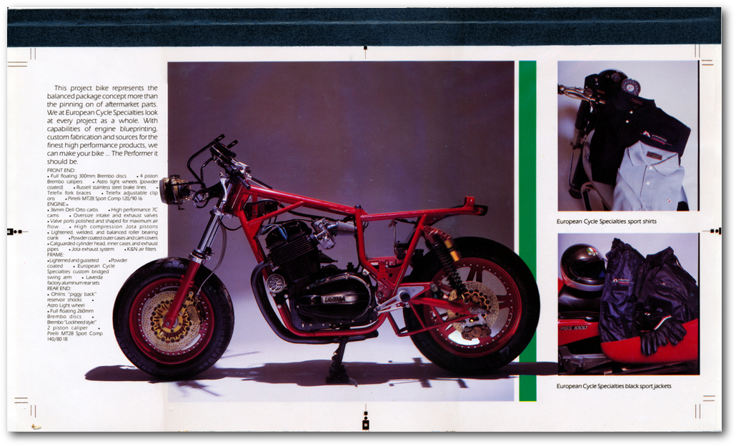
Now as part of this product roll out was the need to photograph all the component parts now coming on the market. This was the period when carbon fiber bits were coming on the market in mass for Ducati bikes. This was a demographic that could afford the new ultra light bits.
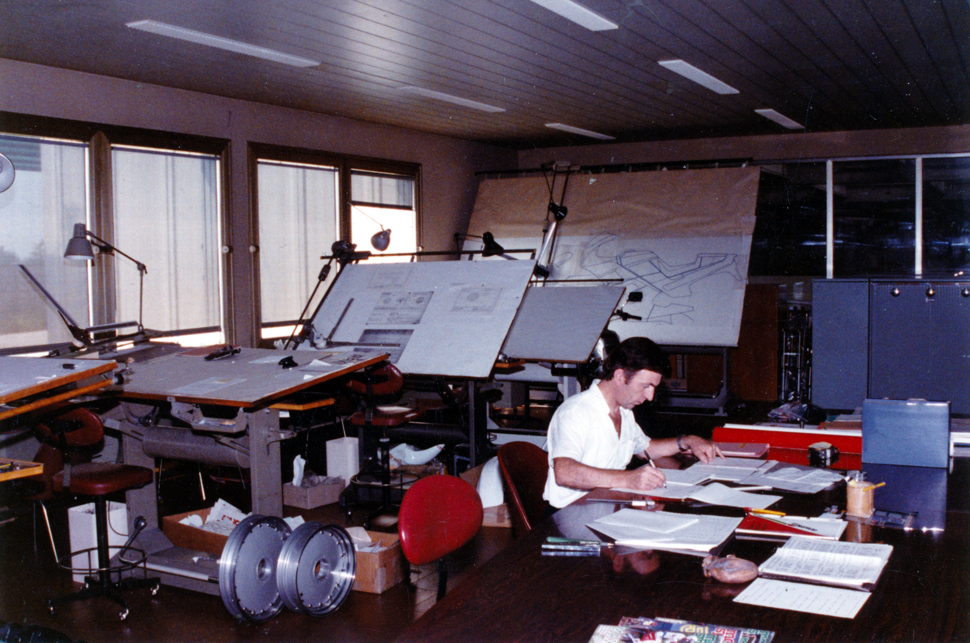
Here the art director stepped into the role of photographer. This whole project was still being done as more or less a favor, and far below any normal project budget. Goes to show what one will do for free access to any bike they want.
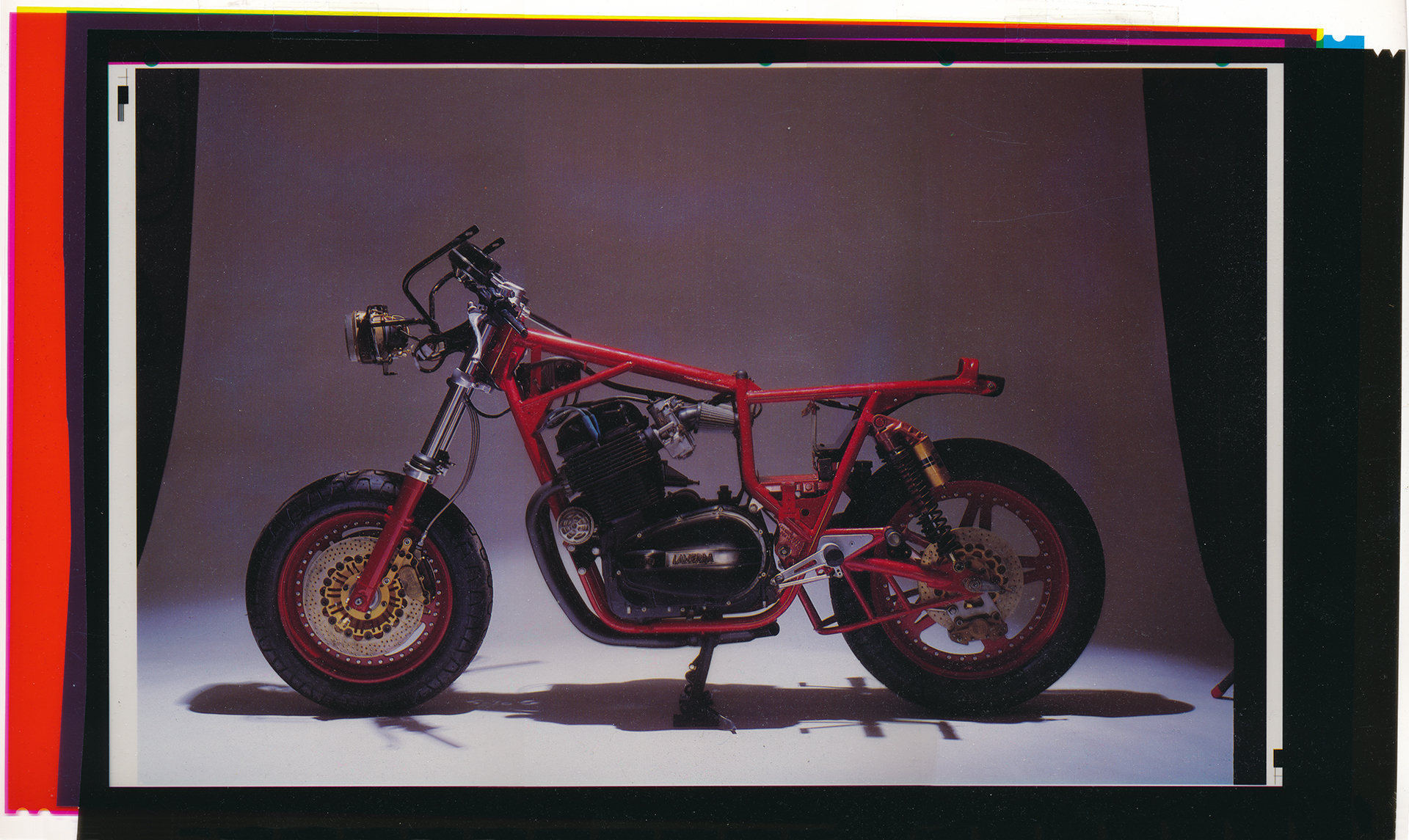
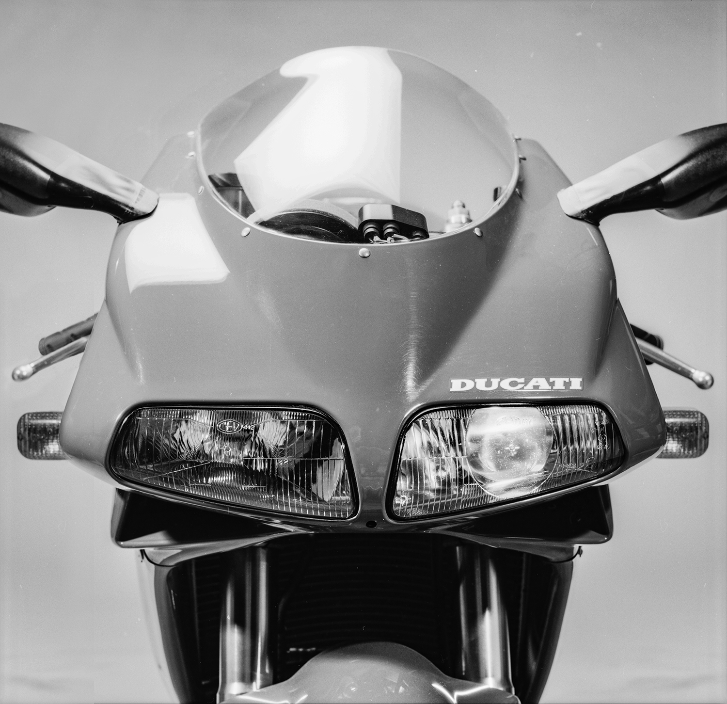
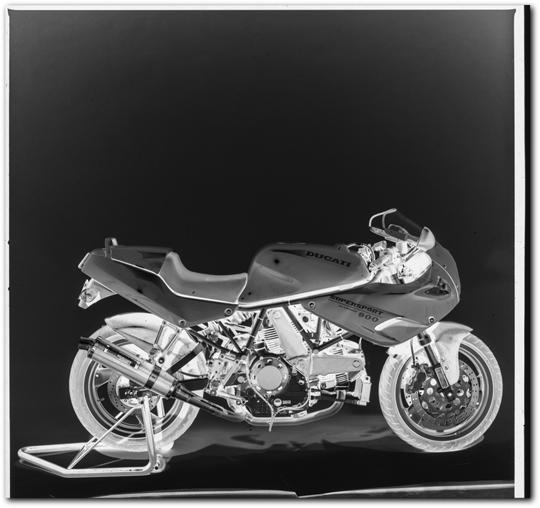
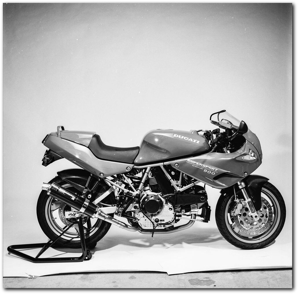
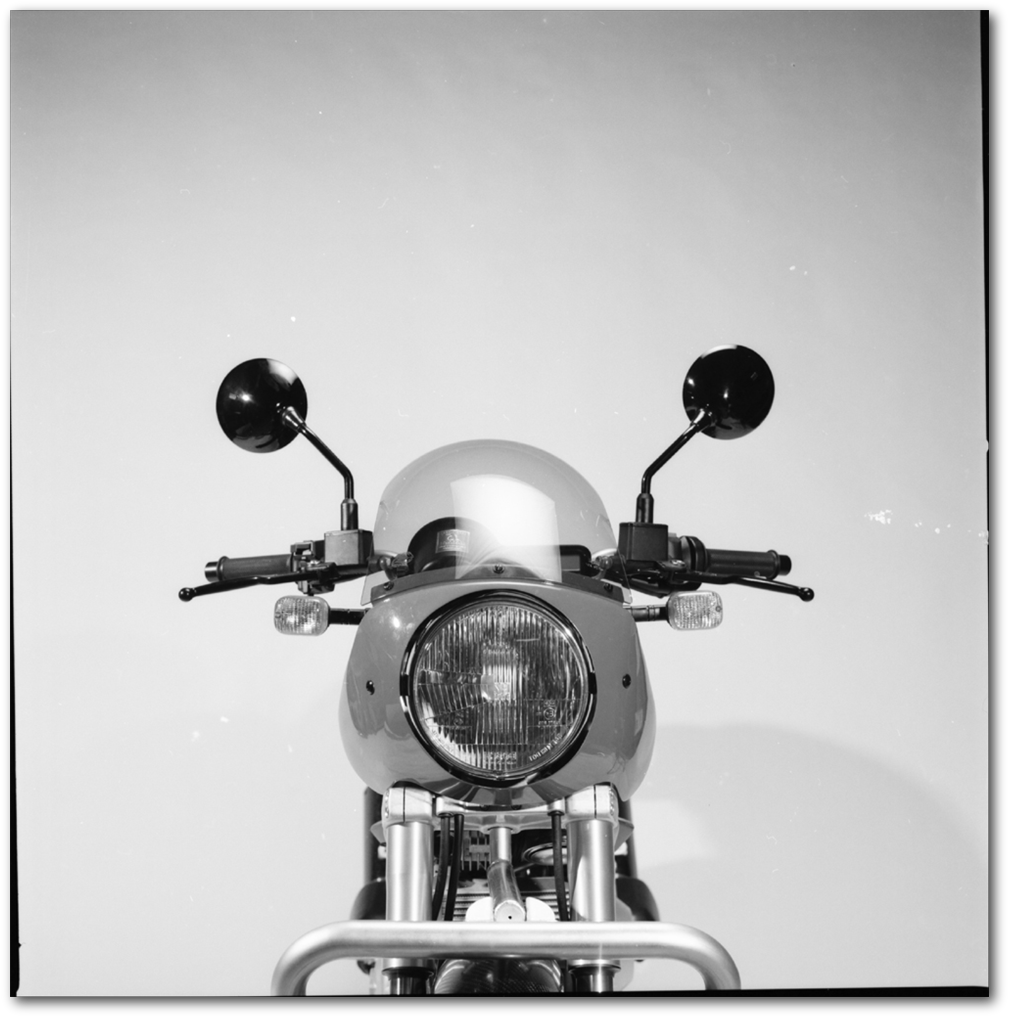
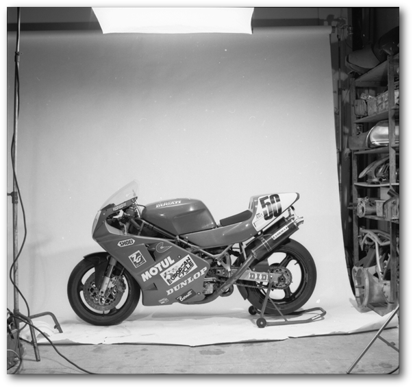
Steve was absorbing the cost of the move to the larger shop, so the project was still operating on a shoestring budget. Combine this with the need for a completely flexible shooting schedule do to product availability. So every ten days or so we would set up a studio right in the shop for a three day shoot. This is made clear by the shots chosen here. These were all shot with a Hasselblad, with full studio rental setup of seamless and lighting. The photos are presented here completely unaltered to give a feel for the time and equipment.
And yes, I art directed, each shot was story boarded in layout, as well as acted as director of photography, lighting and staging. Steve and his mechanics stepped in as studio assistants as needed.


This was just a bit of time-off fun that turned into an international project.
As I wrote in the short story Jota Morning:
“I had spent a few months restoring a Moto Laverda Jota. This thousand cc triple was a classic even then. Stump pulling torque that could take you well beyond 130 before you lowered your helmet visor.
I had the time to do the restoration. I had just finished up the Egyptian project, handed the Red Sea resort contracts and USAID computer operation over to the principals, and found myself just doing what one does between major projects in Southern California. Almost nothing. I chose to spend the time at my friend’s Italian motorcycle dealership, drinking sodas, drinking beers, fiddling, riding. Generally separating myself
from the activities of my peers during the middle of the gogo eighties…”
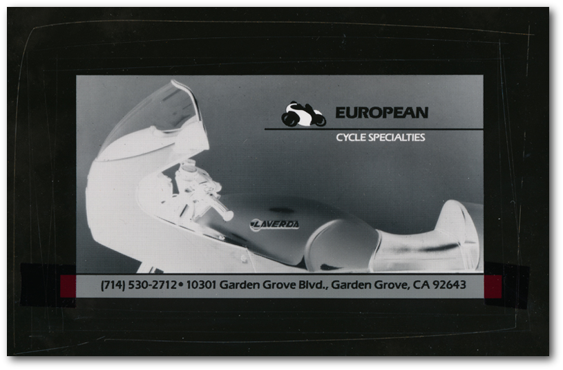
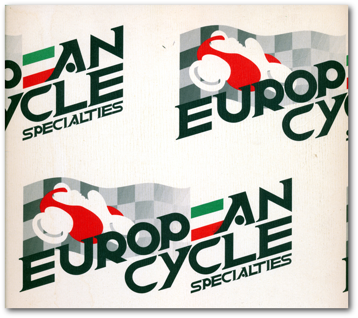
Steve had always had some lame ass, paid nothing for it, identity. It was a mishmash of Italian tank badge imagery that said nothing. Certainly didn’t say anything about him or the special place this shop held in the Southern California motorcycle culture. It was the only European bike shop between LA and San Diego. And even those shops were surprisingly irrelevant.
One day over a soda, or was it a beer, I suggested, “Steve, with this whole new line of Cagiva Ducati stuff coming out you should really step up and get ahead of the pack. Let’s give you a look and run some ads in Cycle News. Bring all of Southern California in here to buy the new bikes.”
“Is this going to cost me something?” He winced from the thought that a dollar might get out of his pocket.
“Oh shut up. Yes. It’s going to cost you something, but certainly not what it will be worth.”
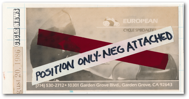

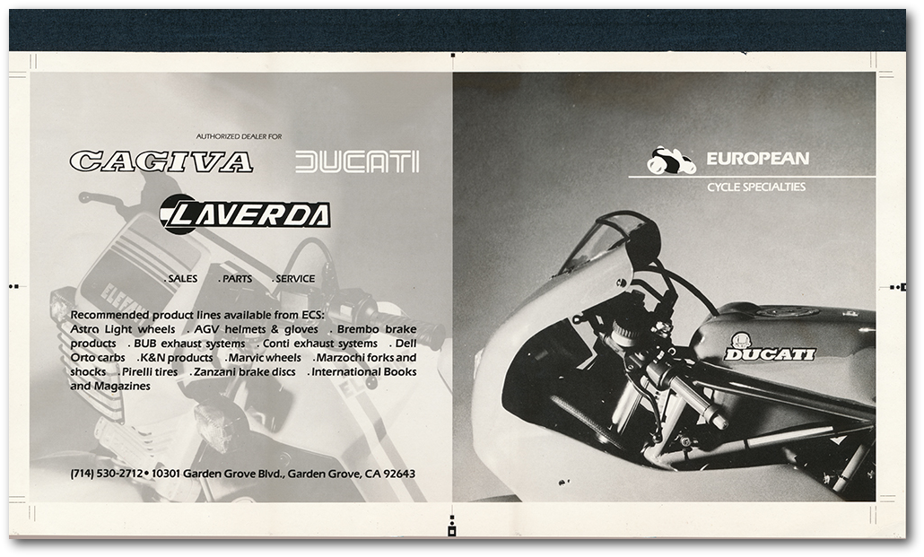

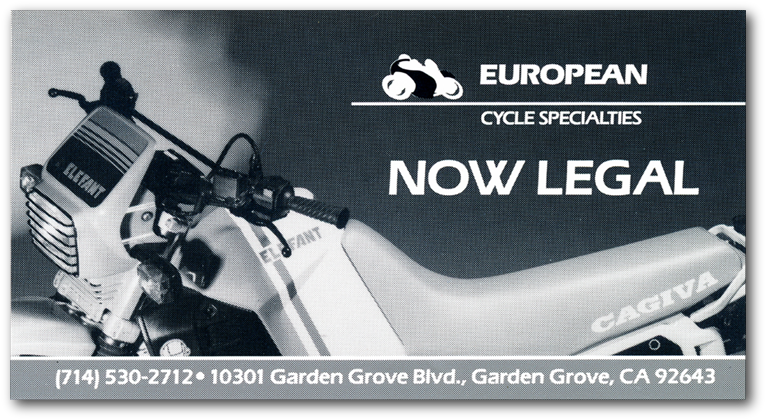

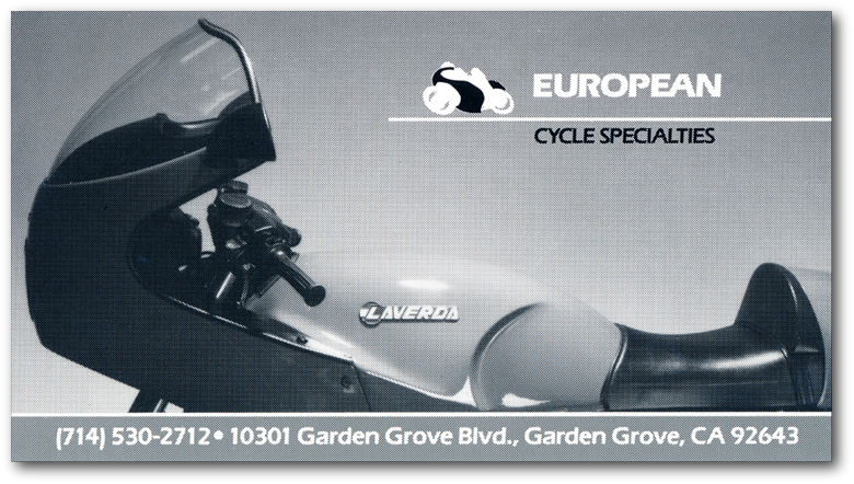
Now if you're looking at these and thinking, "Boy, do they look pixilated." Think again. This was 1986. The images are actually from the stats for insertion into Cycle News. CN was a newspaper format, as such it used a 120 line screen, may have even been a 60 line screen.
Another aspect of this to be appreciated, is this was all done as a personal art project. I was the client essentially, as I acted as full representative for Steve's interests. Steve's knowledge of corporate strategy as expressed through the visual arts as I practiced it at that time was not on the same level of sophistication as his knowledge of how to create a stage 1 through 3 Ducati 888.
While I was certainly doing this in Steve’s best interest I was not looking toward the compensation he could provide. My interests were global. During this time I was targeting the bigger players in the Moto market. Yes, I have used the Italian here. In conjunction with this project, I conducted a full analysis of the American Motorcycle market, current value and future trends, all in relation to the Italian manufacturers place in it. This was a time when the Japanese manufacturers were trying to evolve beyond the crappy handling bikes they had so long established their reputation upon. Their natural method, as in automobiles, was to copy the Italians and out produce them by a factor of 20, to understate it.
As a result of this program for Steve, I was invited to Italy by the motorcycle division of the world’s largest brake company, Brembo, to solve their American market problem. Their problem was simple, their current national representative was selling 85k worth of product a year in a 20 million dollar market.
The invitation extended was during the same week as the Esposizione Internationale Ciclo e Motoiclo in Milan. In preparation for the trip over the analysis composed was packaged for individual presentation. Meetings were arranged with the directors of all the major motorcycle companies. The message would be simple: “The Japanese are kicking your ass by shamelessly coping you.”
So by spending a bit of time during my extended high-speed vacation at the Italian moto riders social club, and redefining it for a broader national market, I stepped back into my own world.
Consulting work was done for Moto Guzzi, Moto Laverda, Bimota, Brembo Brakes Italia and Aprilia. We also worked closely with the California Air Resources Board, the US Department of Transportation, Peat Marwick Europe, Credito Italiano, The Veneto Regional Authorities and Techofin (the financial regional authorities of Trento).
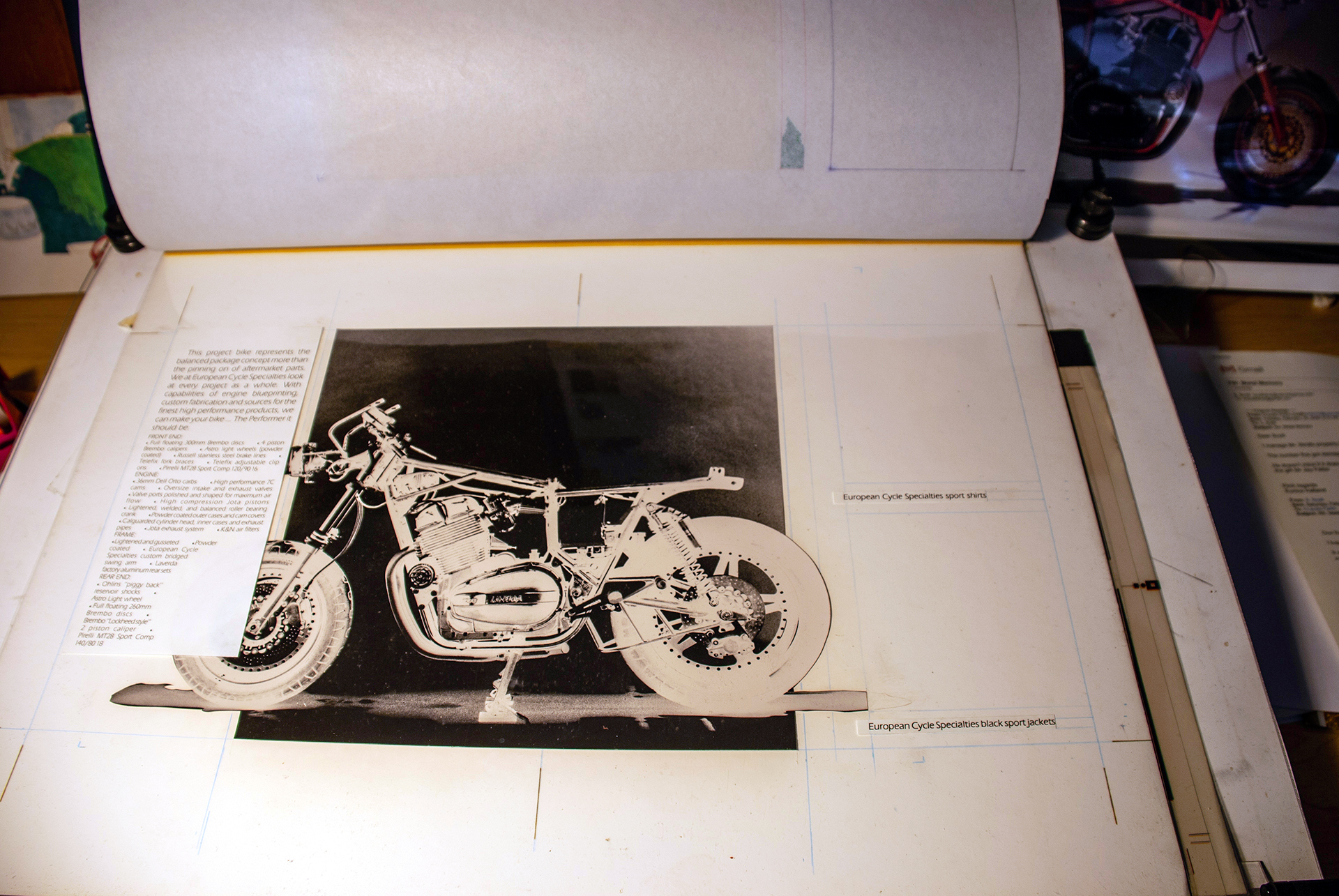
These are two and a quarter format contact prints being used for size and proportion of catalogue pages and images. Once again presented here to give a flavor of art production at the time.
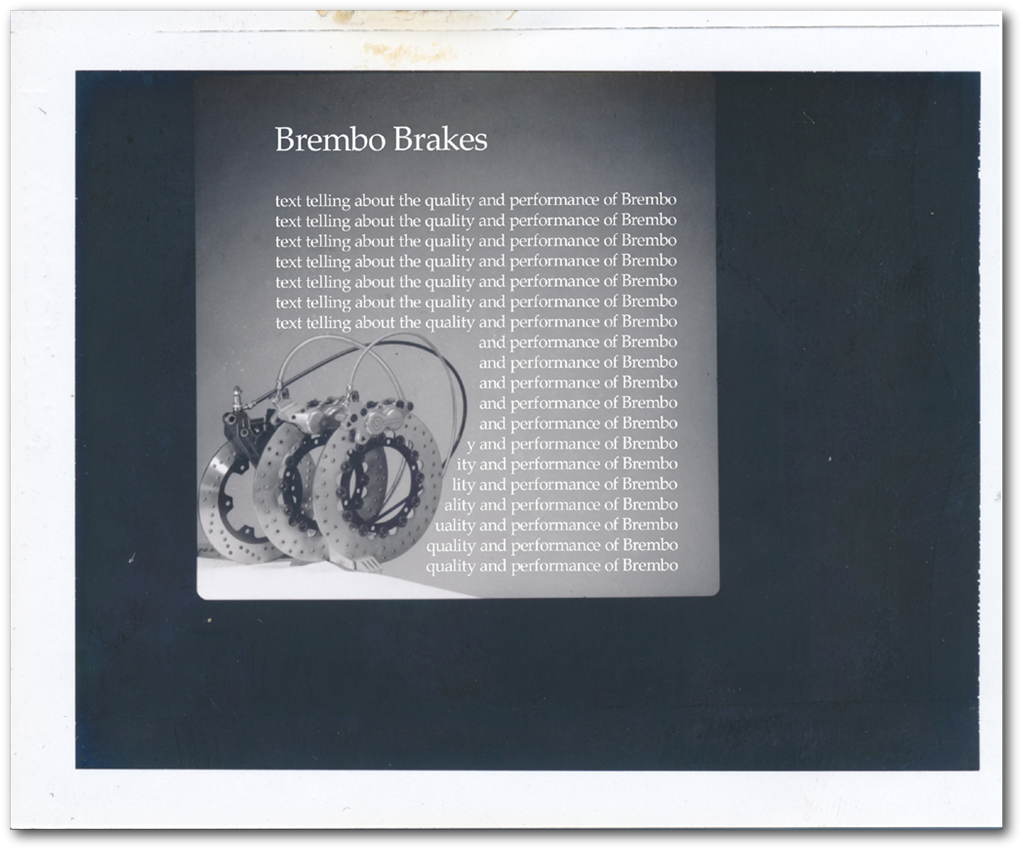
In this image the text has been Greeked in to show the layout method we innovated in the Eighties. It had its roots in the traditions of the Chicago school of Swiss Grafis so much a part of the early Seventies apprenticeship.
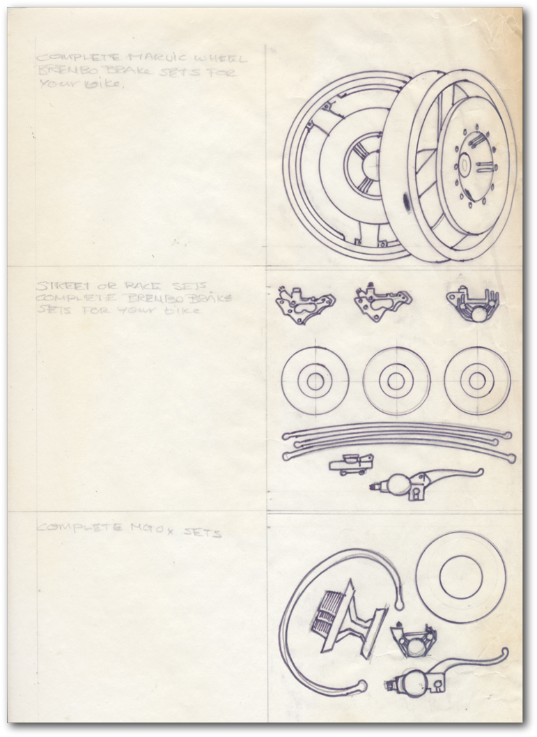
Featuring some new images recently found in the archives.
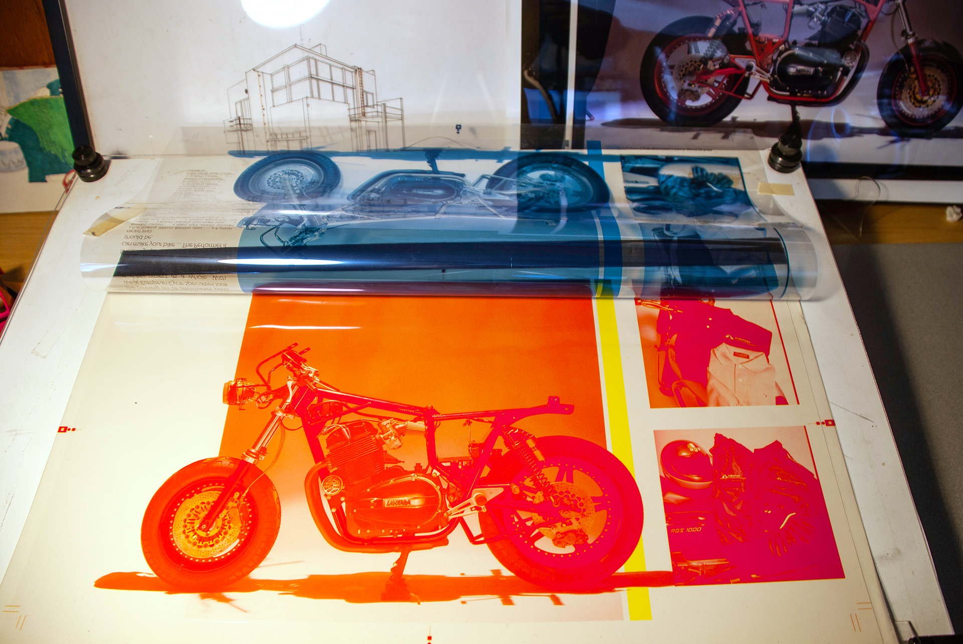
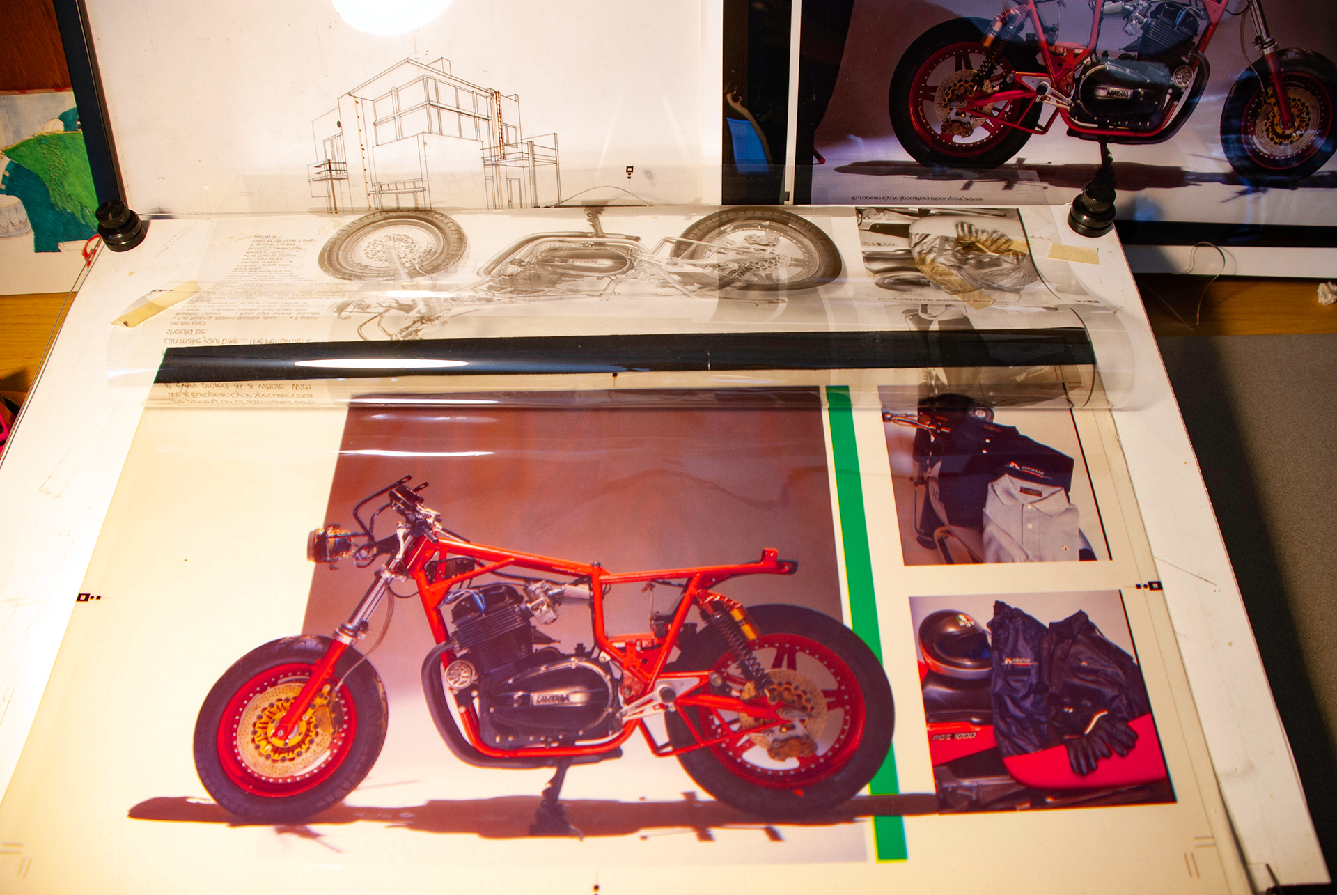
For all you digital age designers let me explain what your looking at before going into the story behind this project,.
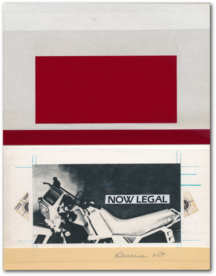
Above is a four color film separation color key. This was the step where the printer took the product shot and separated it into the Cyan, Magenta, Yellow and Black films, to make the four printing plates. You'll see this separation below with some of the films separated to fully appreciate this pre-press stage.
Below we have the production boards. This were the boards upon which the production artist applied the type from the type setters, and here on this board you will see a hand cut Rubylith film layer, laid on logo image which was hand drawn on the board.
Explanations will follow the images you will see.
Then I evolved the type into a corporate ID typeface. Here is the production board with the original drawing of the font.
Here are the shots of the film separations mentioned above.
The first is the cyan, yellow, magenta, minus the black.
The next is the cyan and yellow films.
This shows another stage of the pre-press process we have lost, and that is the graphic assistance of master type setters, producing your type in position for the boards.
Cover shot for the catalogue, from the 2 1/4 square Hasselblad negative.
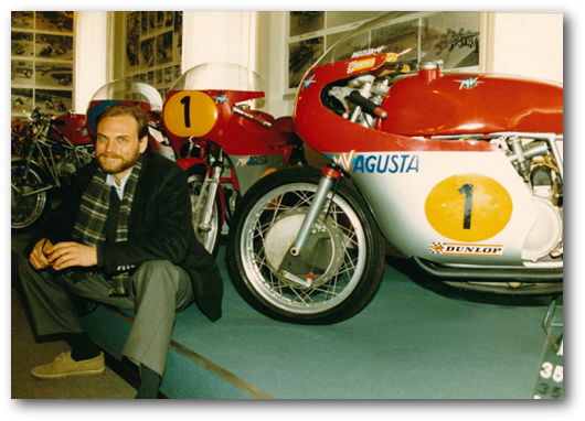
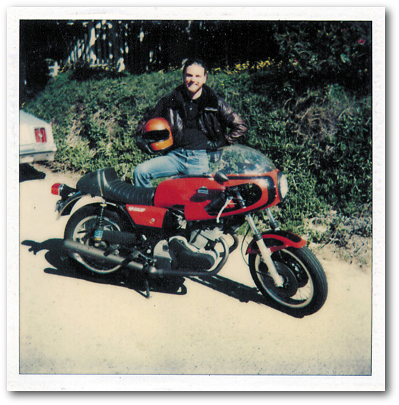
And last up here is a photo of your intrepid director of operations with his Laverda 750 SFII/C built by Steve. The photo was taken in Laguna Beach in 1978.
REFLECTIONS:
EUR0PEAN CYCLE SPECIATIES
The project moves to Italy

There were a number of projects in play within this project. One was the restructure of North American distributorships and dealer networks relative to actual market potential. Now this sounds all very general, but one has to appreciate that when arriving in Italy the traditional manner of awarding international distribution rights was still in place. Without sounding too cynical in comment, this involved awarding distribution rights to whom every wrote the biggest check for bikes and parts for the next year. The strategy presented was simple, set up a beach head and manage service tech training, simultaneous to shipping parts inventory, to be followed by the bikes to dealerships that have been selected and approved. Meeting standards from financial capability to market coverage. Sounds simple and obvious now, but it was all being operated by 1970s standards of catch as catch can, if you will. The comfortable market element at work in all of this was the Italian companies annual production projections and capacity were addressed to their successful sales in Italy and the EU.
A primary focus in all this was addressing future global emissions standards at early stage engine design and development. This ran counter to the then current method which was completely reactive, i.e. sending finished bikes over to Dellorto carburetors 'emissions' shed and mounting smaller carbs until Switzerland's standard was met.
An initial project was the invitation by the board of Moto Guzzi to compose a restructure strategy. Its focus was to utilize the talent base at Moto Guzzi, which was still all in place at this time, to develop future product targets. Designs that were already in the pipeline, but unsupported by parsimonious ownership. As one of the directors of the board said in hiring me, "I'm using you as a club to hit DeTomaso over the head with." It sounds just about the same in Italian. I personally wanted to reintroduce a Falcone for the Twenty First Century. A performance bike that would address entry level ridership and an aging rider demographic, a yet to be defined market at that time. This resulted in an M&A a couple of years later.
Upon arrival in Italy and subsequent meetings it became apparent Moto Laverda was in trouble. This was a personal favorite Marque. This resulted in an M&A project that was complicated by the company being managed under a Cassa Integrazione. The intent of course was the restructure of Moto Laverda to manage its reentry into the market as a healthy, independent Marque.
An impressive opportunity presented by the timing of all of this was factory retooling at this time of machine tool advancement, while in the same moment addressing manufacturing throughput that fully utilized the tradition of Italian journeyman machinist craftsmanship and the new generation of polyTechnic school grads coming on line.
Sidelines were the solving of Bimoto's US certification problems, and composing the strategy for Aprilia's reentry into the North American market.
An interesting sidebar implied within all of this was the focus of developing engines that addressed the current and future emissions issue on the front end, rather than as an afterthought. In a global manner this was achieved by establishing an internal working relationship with the California Air Resources Board to construct a CARB facility in Northern Italy. A facility to be used by all the Marques, thus having the ability to sign bikes legal for the most stringent markets, like California, Switzerland and Singapore, prior to importation.
The late Eighties was a time dramatic transformation, that we utilized to address all of these aspects of manufacture and marketing.
There are lots of great stories here, both professional and personal, which were defined by years of effort by a wonderful group of professionals, that became associates and partners, who are fondly remembered as dear friends.