The client here was an electronics firm in the field of corporate security. Here we see the comps for the promotional brochure, for trade show and sales team in the field. The corporate ID, comp’d in here, was part of the project.
The Polaroid at right was the test for the product shots. This was also basis for the brochure shots and the black & white business publication ads.
The color film shown was the basis for the four color business journal ads. Early Silicon Valley electronic security.
The point here? To bring life to this incredibly inert object.
REFLECTIONS;
THE LOST ART OF THE COMP
The Comprehensive was the backbone of the advertising business from the 1950s through the 80s.
The art of these renderings was the fact that they had to be done rapidly and in one pass. No overworking or corrections allowed. An initial pencil sketch was laid down. The Rapidograph drawing was then done. The third dimension was then defined by the design marker finish. These drawings, when done right, took no more than twenty minutes.
It was here the art director communicated to the client the ad concept in finished form. Here was the detail for the photographer's studio or location shoot. The production artist saw the board in layout. The printer knew what was to be done.
This was an art learned in the studios during the Chicago period, from some masters of the art form. I present here only a few of those done between the 1970s and the 1990s. Not many, you see, survived beyond the creative team cycle.
It was the quality of these renderings that moved an artist through the art department to Art Director and the chair of the Creative Director.
1978
1982
1981
Before the doors opened at the San Francisco Sporting Goods show a client meeting was held at Walton Powell’s booth. Powell was a pillar of the Fly Fishing community with his $1500 hand made bamboo rods. He had been experimenting with graphite, because he saw the potential for the graphite to replicate the performance of bamboo at a fraction of the cost, thus generationally expanding the market through price point. After a couple of years of testing, he and his new backers were ready for the market.
Ads for fly rods in those days were full page travel shots. A majestic mountain in the background, a fly fisherman standing in some crystalline stream. The rod accounted for about one one-hundredth of the ad space.
The important thing to fly fishermen is the quality of the rods construction. To highlight the fact that the bindings, for example, were of the same superb quality on the graphite rods as the Bamboo, close examination of detail was chosen. Another detail important to this demographic is Walton's signature, here representing an important aspect of the Comp method: the clear representation of type, in this comp Walton's corporate ID signature in both the positive and in the reverse.
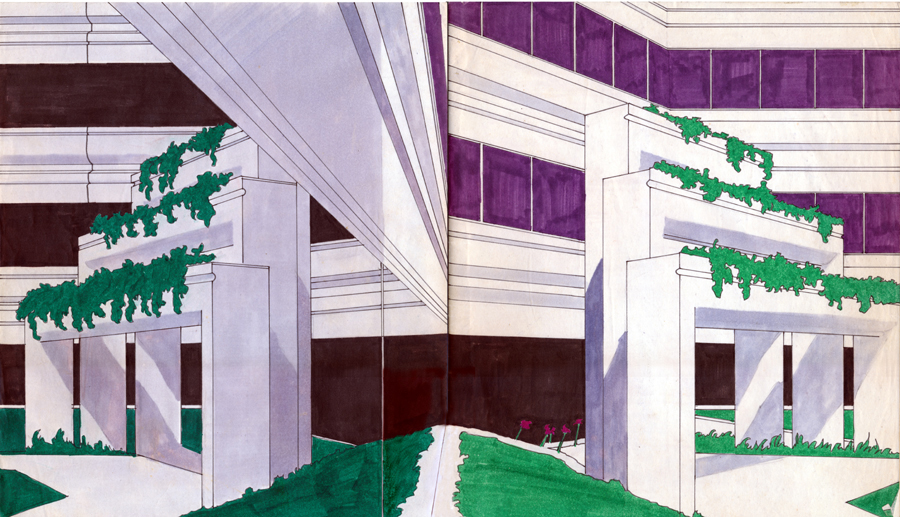
This shows a comp being used to express a complex and innovative corporate strategy.
The San Francisco office of the architectural firm Whistler Patri wanted something more than a series of ads in the prominent architectural magazine.
In talking to them it became apparent their main concern was the dramatic challenges being presented by all the electronic plumbing, if you will, that had to be incorporated into their clients commercial locations by the onset of computer systems integration. They wanted to be able to somehow communicate to the CEOs the complexity this was presenting to renovations and construction.
The concept presented by these comps is for the publication of a quarterly magazine. In every issue six prominent writers in the field of engineering, architecture and design would address these issues in editorial detail.
The basis of the strategy was that if you take the time to provide a deep understanding of the subject to the target market they will come to you for advice and services. It was direct mailed to the CEOs offices through a relationship with the Association of Executive Secretaries.
Whistler Patri’s name appeared only on the masthead as publisher.
The comp that became an ad campaign.
Dodge Ridge had a problem. It wasn’t Northstar. The hills of Sonora were milder and year over year income had resulted in a modest facility. In the past they had always tried to compete head to head with Tahoe. It wasn’t working.
My concept was simple: refocus the demographic target.
The original presentation comp was finished as a completed Rapidograph rendering with a bit of air brush.
It was run in the Bay Area sports weekly City Sports. The gate went up over 300% in the first two weeks.


As pointed out at the beginning, the basis of the Comp is quick and clean pencil work to determine the math, and spirit, of the layout. A sheet of Comp paper is then taped over these pencils and the rapidograph / design marker layout it produced, rapidly. Here are a couple of pencil sketches for an RFP. Truth be told, my neighbor on Russian Hill in the early 1980s was the long time marketing director for Beaulieu Vineyards. He and I were talking and he asked for a couple of comps for my Adds the Color concept. The concept was to take a more casual, light hearted, approach to wine marketing in the changing demographic environment.
1982
1983
1984
Though this was just a simple design for a local photographer, a friend and his studio it is shown here as a minimalist counter point to the banal florid post Modern graphic design becoming popular in the City at the time.
1990
Here we have a comp to express the 3D construction of the concept. It is here expressed by graphic representation of an actual AT&T billing department data process punch card laid over and revealing beneath it a Johannes Itten color chart. You'll see the logo type was evolved in process.
Below that is the final print of the media kit inserts. For the top page I used the design marker comp images of the then very current Apple computers for the final art, done in art chalk. Representing the rather cold technical equipment with an aesthetic graphic warmth.
This entire art production process of this project was produced with feet in both worlds, the traditional and the digital.