Aero Sport started as a meeting in a small beach house in LA. The meeting had been one of many to discuss a project for the construction and management of Cancer centers built on the footprint of major hospital campuses. Unknown to the doctor, the funding was already in place through a financial group behind the third largest phone company at the time.
While going over the paperwork of this project the doctor stands up and says, “Hey have a look at this. This is probably something you could put together in your sleep.”
The doctor’s parents had just come back from one of those late eighties trips over to China; a brief walk through Zhou Enlai’s open door. While touring the Great Wall, they saw some kids playing this game with a couple of shuttlecocks, whose cork heads had been replaced by suction cups. The two kids were catching them with a small plastic disc strapped to their hands. The parents bought a set for the grandkids.
The doc had removed the shuttlecock’s feathers, which were of course plastic in this case. He had replaced them, rather tenuously, with three delta-winged pieces of acetate and scotch tape. He handed me a paddle, and threw the shuttlecock to me a few feet away. To mollify his enthusiasm, while we proceeded with the more significant project, I replied, “OK.” And took it from there.
The first step was to name the toy and give it an identity, while reanalyzing the product design and fabrication.
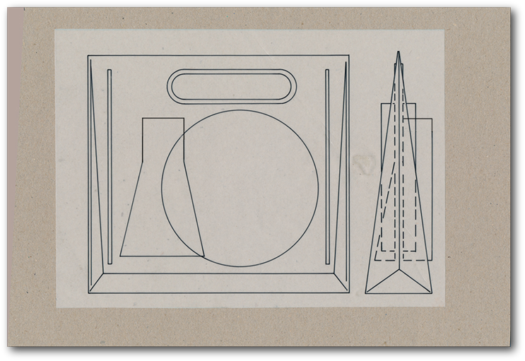
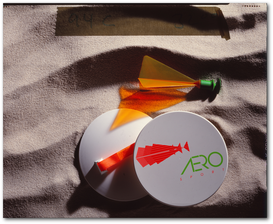
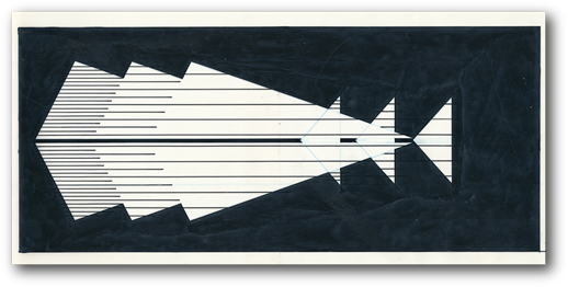
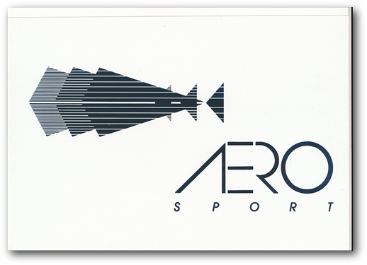
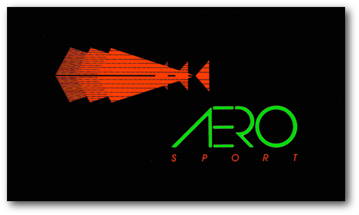
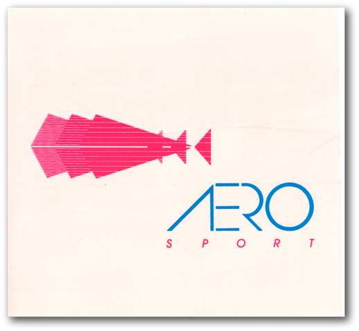
I selected the name Aero Sport. While simultaneously designing the toy-in-motion identity. The upper image on right is the original rapidograph rendering of the logo. The typeface was developed for the name to give it lightness to imply the airborne aspect and the strength to underline the product quality. A number of color combinations were chosen to give the product line its production identity.
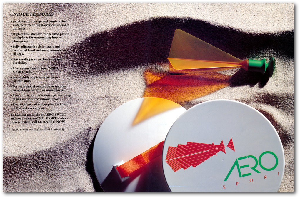
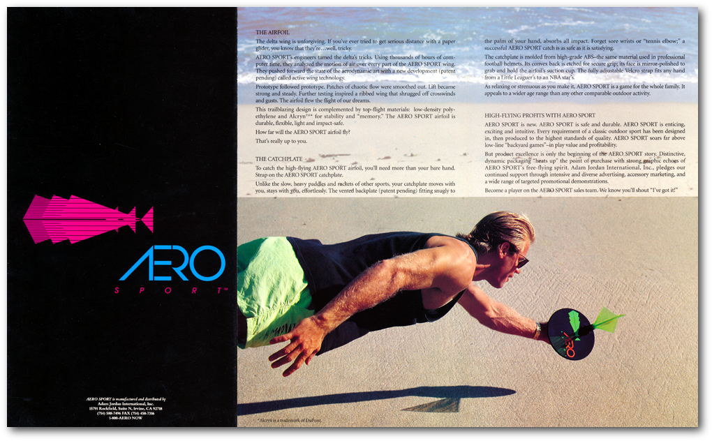
I then moved onto the paddle. Here a number of factors were considered. To compensate for impact on the players hands at impact the single surface discs were designed with a convex back attached to the disc. Velcro straps for unlimited adjustment were included. The material chosen was the same ABS composition of football helmets. Two colors were selected for the paddles, white and black, upon which the florescent colors would stand out.
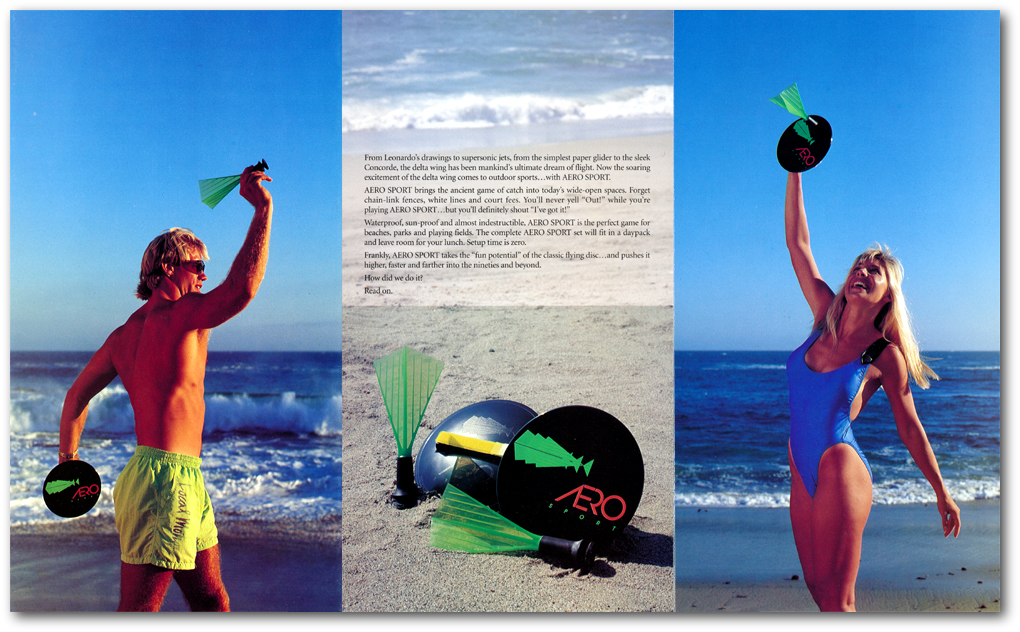
For the airfoils a suction cup structure was designed to give strength and longevity. For the wings a thin translucent flexible plastic was chosen.
Then the packaging was designed. While this was in process the complete ‘game rules’ were written laid out into an insert for the packaging.
With the initial dyes completed it was time to spend some long nights at the injection molding company to run some off.
This was all done with an eye on the date of the next National Sporting Goods show in Chicago.
The complex ‘paddles' came through production without a hitch. The logo was molded in to the convex hand surface, the color logo and type face silk screened on to the paddle face.
The airfoils were another matter. While the initial test showed the airfoils flew beautifully, the failure rate through injection molding was running at 75 to 80%. The flexible, and safe for players of all ages, translucent plastic was curling beyond repair when cooling out of the molds.
With the NSGA show in Chicago coming up, I injection molded some stiff translucent airfoil wings for the product shots. The shots were done by the masterful Richard Fukuhara in Orange California.
The entire market target was impacted by the fact that the country was just going into the first Bush recession. So price point was set at 19.95 retail. The Debut in Chicago was beyond expectation, even when mentioned we were dealing with airfoil problems. Orders were strong for the Christmas season.
Once back in Southern California, the failure rate had to be addressed. Sitting with our dye maker at around midnight, drinking shop made Irish coffees and smoking cigars, we went over every aspect of the three piece release mold and the injection process. Then, almost in chorus, we said, “lets use the logo.”
So we came up with an exoskeleton design based on the logo that would give support to the thin wings by using the design lines as flow channels for the plastic. We referred to these as the bat wind design.
Over the following three days, using the existing molds, we completely re-machined them to the new design. Failure rate at injection dropped from 75% to near zero. The flight distance and performance control dramatically increased. The turbo design created a turbulence that gave much better directional control.


REFLECTIONS:
A PRODUCT FROM SCRATCH
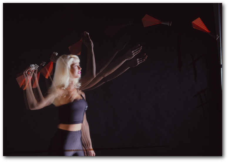
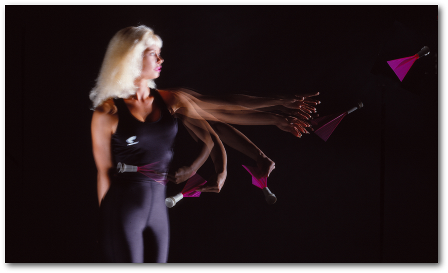
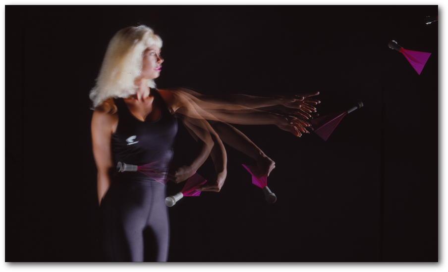
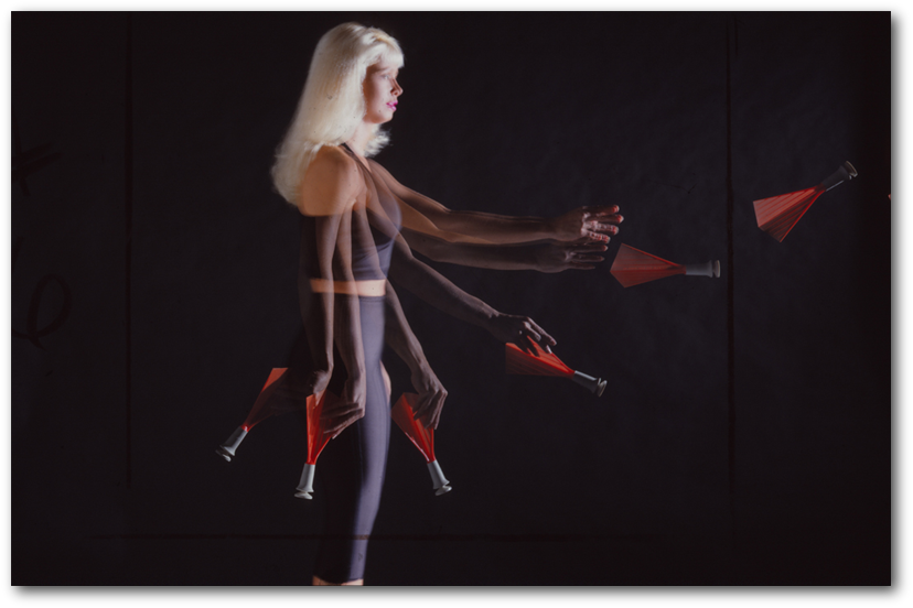
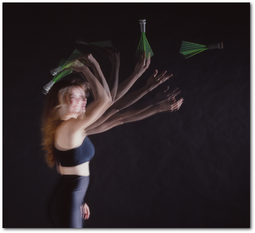
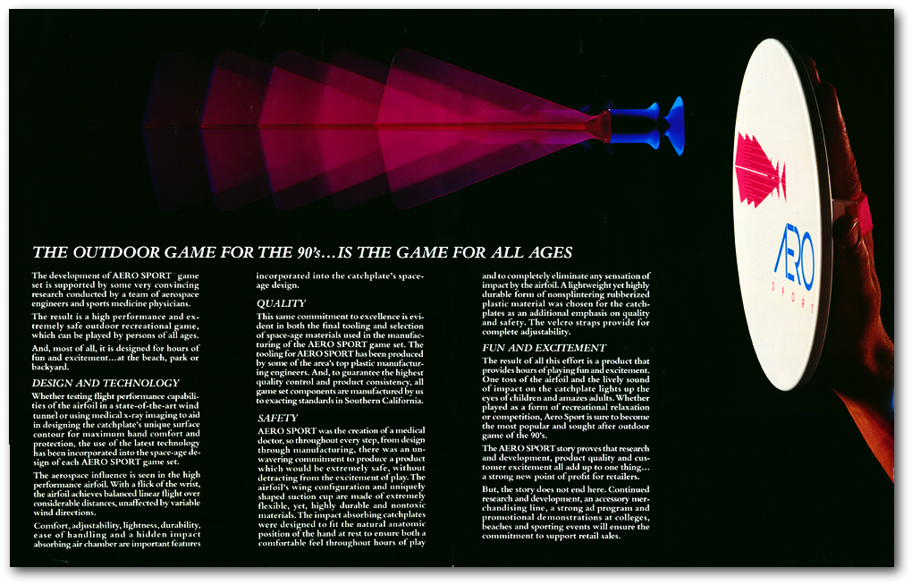
Multi-strobe in-camera studies
of tossing techniques for the instructions.
Here are the original 4 X 5 film transparencies